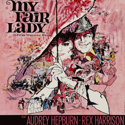
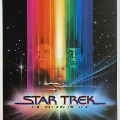
Bob Peak’s posters rarely feel shy. Faces, movement, colour and atmosphere pile into the composition, yet the good ones still know exactly where they want you to look.
Peak worked across commercial illustration, but cinema gave him the perfect scale for his approach. He helped push movie advertising towards the expansive, painterly style that became such a huge part of late twentieth-century film imagery.
Ensemble, Scale and Movement
What appeals to us is that the posters feel designed rather than merely assembled. There may be several characters and scenes competing for space, but the painting, cropping and movement tie them together. On a wall, they have presence.
Peak is also a useful artist for seeing how movie-poster illustration evolved before the 1980s blockbuster look fully took over. If you love that later period, tracing the line backwards through his work makes a lot of sense.
Poster Spotlight

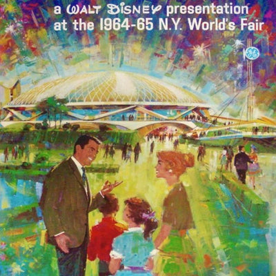
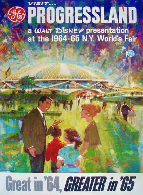
Visit Walt Disney's Progressland - New York World's Fair 1964-65
A large-scale 1964 World's Fair commission, showing Peak's painterly range well beyond the cinema work he is best known for.
View Poster
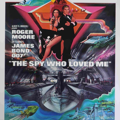
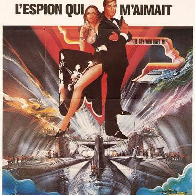
The Spy Who Loved Me
A James Bond campaign, illustrating how Peak brought the same painterly confidence to a completely different kind of franchise.
View PosterA Note for Collectors
Major films can have several campaigns and international variants, sometimes involving different artists, so we would never attribute a poster to Peak simply because it looks like him or sits in a general artist collection. The exact artwork and issue should support the attribution.
Explore More
Browse our Bob Peak collection, or continue with Tom Jung, Drew Struzan, Richard Amsel and our Poster History guide.
Original Posters by Bob Peak
A live look at Bob Peak posters currently in the Printed Originals collection.