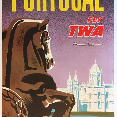
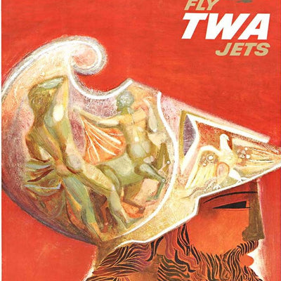
Vintage airline posters can make modern travel feel slightly disappointing. David Klein’s TWA work belongs to an era when getting on a plane was sold as glamorous, optimistic and genuinely new.
Klein’s posters use colour brilliantly. Some are recognisable city scenes; others push much further into stylisation, turning a destination into movement, pattern and atmosphere rather than a literal view.
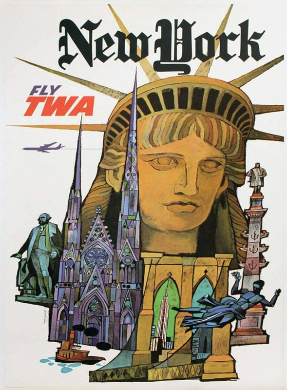
A Destination in a Few Seconds
This is one of the reasons we love Mid-Century travel advertising. The poster is not trying to show you everything about New York, Paris or another destination. It is trying to make you want to go there, usually in a couple of seconds.
For collectors, Klein can lead in several directions at once: TWA, aviation, a favourite city or Mid-Century graphic design. That makes his work particularly enjoyable to build around.
Poster Spotlight

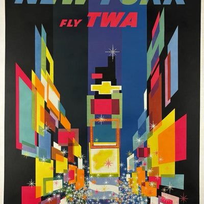
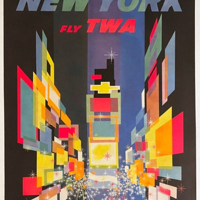
TWA - New York
New York reduced to fireworks and skyline — one of the most recognisable images in Klein's TWA series.
View Poster
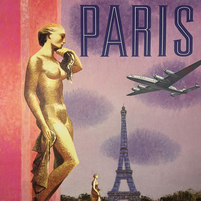
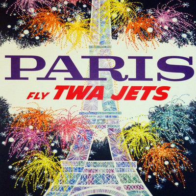
TWA - Paris
A completely different palette and mood for Paris, showing how far Klein pushed stylisation city to city.
View Poster
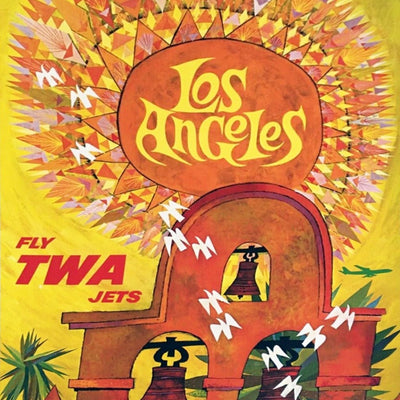
TWA - Los Angeles
Los Angeles rendered through colour and pattern rather than a literal skyline, typical of Klein's most abstract destination work.
View PosterA Note for Collectors
Popular airline imagery has been reproduced extensively for decor as well as posters, so an original needs more than the right picture. Dimensions, paper, printer information, date and provenance all help establish what the sheet actually is — see our sizes & formats guide for expected TWA dimensions.
Explore More
Browse our David Klein collection, or continue with A.M. Cassandre and our Poster History guide.
Original Posters by David Klein
A live look at David Klein posters currently in the Printed Originals collection.