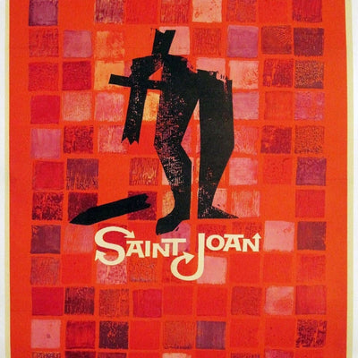
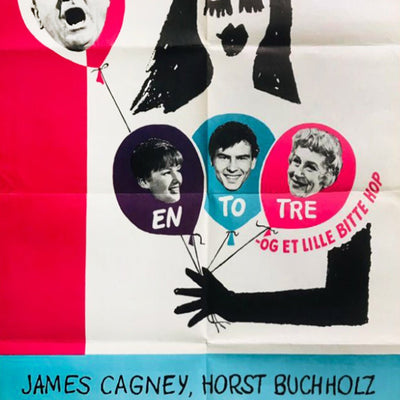
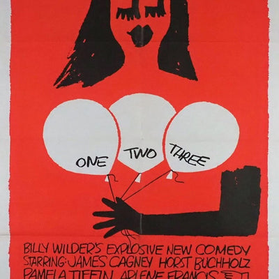
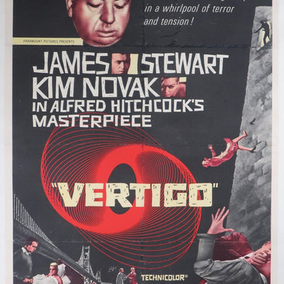
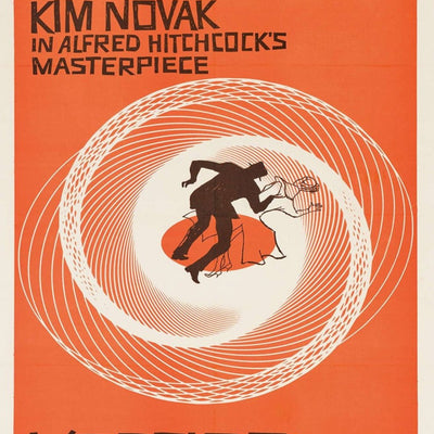
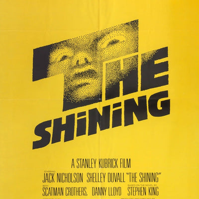
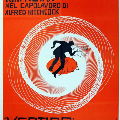
This is probably the easiest way to explain why Saul Bass matters. Give most film campaigns a cast, a plot and a sheet of paper and they try to fit all three onto it. Bass was prepared to throw almost everything away.
A broken arm. A spiral. A rough shape. Hand-cut lettering. His best film work finds one visual idea and trusts it. That approach feels obvious now only because designers such as Bass proved how powerful it could be.
We love illustrated One-Sheets, so Bass is almost the opposite of some of our other favourite movie-poster artists. That contrast is exactly why he is interesting. A Bob Peak or Drew Struzan composition can pull a whole cinematic world onto the page; Bass can make you uneasy with a few shapes and a piece of type.
Vertigo is naturally one of the posters collectors associate most strongly with him, but looking beyond the obvious title is worthwhile. His work across film identity, titles and graphic design makes the posters part of a much bigger visual language.
As always, collect the actual issue rather than just the famous image. Country, format, release and printing date matter, particularly when a design has been reused later.
What to Look For When Collecting Saul Bass
His most famous designs, including Vertigo, have circulated widely in later re-releases and reproductions. Confirm the country, format and print date of the specific issue rather than collecting on the strength of the image alone.
Original Posters by Saul Bass
A live look at Saul Bass posters currently in the Printed Originals collection.